Pfizer drops the blue pill, kicks off 2021 with new DNA logo
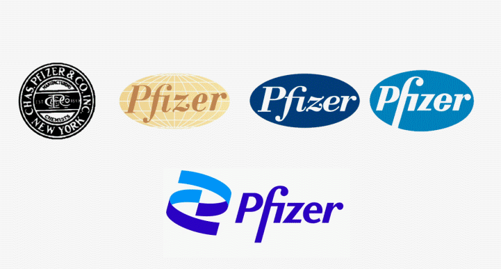
Pharma companies are always talking about moving ‘beyond the pill’, and Pfizer’s new brand identity embodies that – it’s decades old pill-like logo has been replaced with a DNA double helix that it says reflects its commitment to breakthrough science.
The logo – which retains the company’s traditional blue colour scheme – has been more than 18 months in the making and according to the company it is “unlocking the pill to reveal Pfizer’s DNA: the power of science.”
https://twitter.com/AlbertBourla/status/1346415826925203456
It’s likely no coincidence that Pfizer’s flagship project in 2020 while the design of the logo was being finalised was unquestionably its high-profile alliance with BioNTech on the RNA-based coronavirus vaccine Comirnaty, which provided further evidence of the potential of harnessing genetic toolkits to tackle health issues.
In fact, one wag on Twitter compared the time taken to come up with logo to the mere seven months Pfizer and BioNtech needed to bring their COVID-19 vaccine through clinical testing:
https://twitter.com/TinglongDai/status/1346533040525344769
Another took issue with the orientation of the helix part of the logo, claiming it overlooks some basic scientific principles.
[embed]https://twitter.com/ThomasH20867320/status/1346520199298650112[/embed]
Pfizer has also been changing a lot in the last few years, moving away from being a diversified healthcare company covering branded human and animal medicines, generics and consumer health products to one focused on novel therapies.
Last year, it exited generics – which had been a drain on profit – after combining its Upjohn unit with Mylan to form Viatris. It’s also in the process of offloading consumer health into a joint venture with GlaxoSmithKline and several years ago spun out its animal health assets into standalone company Zoetis, so as to concentrate on higher-margin, innovative drugs.
The logo also “signals [a] shift from commerce to science”, according to an explanation on Pfizer’s website, but retains the same tagline as its predecessor: “Breakthroughs that change patients’ lives.”
A Wall Street Journal article notes that Pfizer surveyed more than 4,000 patients and 2,000 doctors across multiple countries, and held 12 internal focus groups, before deciding on the new design.
“Our new identity reflects the dignity of Pfizer’s history and captures the innovative spirit and science focus alive in the company today,” said Sally Susman, Pfizer’s executive vice president and chief corporate affairs officer.