mHealth Monthly Mashup: release 16.0 – what “responsive design” means for mobile health and pharma

Michael Spitz
Zemoga
Technologists, despite their almost religious faith in transcendent reason and geeky cleverness, are hardly immune to irrational superstition, lemmings-over-the-cliff trends, and ridiculous speculation. The scientific fraud that is String Theory (and its cataclysmic results to the worldwide physics community) is but one extreme and egregious case in point, far as mobile health goes, we need to take a detailed look at “responsive design” to determine if the current buzz warrants all the attention and resources for perhaps the toughest and most risk-averse customers of all, pharma and medical device manufacturers.
 ,
"...we need to take a detailed look at ‘responsive design’ to determine if the current buzz warrants all the attention..."
 ,
From “optimization” to “responsiveness”
For the past few years we’ve had two choices when pursuing a multi-channel strategy: build a conventional website with a “mobile optimized” version sniffed-out then accessible for smartphone users, or build the website and a completely unique smartphone instance from scratch, better suited for mobile users yet more expensive and time intensive to develop. “Responsive design” has since become a compelling third option, where the code base and content for the website itself dynamically morphs to accommodate a complete array of mobile devices. Many find this choice fresh and appealing, but is it viable for pharma yet?
In principle, the ability to create a single digital experience that “responds” to diverse screens and operating systems sounds terrific. Allegedly gone are the days when communicators must create a website for desktop computers in isolation, than construct it back up from the beginning for smartphones and tablets in all their respective sizes, combinations, and operating systems. Instead, digital designers and developers need only create a single “responsive” experience that automatically reconfigures critical elements such as navigation, layout, images, and content in a manner that fits the needs of every device and gadget.
“Responsive design” for mobile works in exactly this way. By using a single html codebase and flexible grid, images, and queries, the unique instance dynamically repurposes itself according to the available digital real estate. Whereas a desktop visitor might see three columns, complete navigation, and call-out boxes, smartphone users would experience a single, compressed column with limited calls-to-action, and a tablet user a still different experience, optimally configured for the larger yet still portable touch screen environment. The result is a simpler, sleeker digital option, with a build-in economy of scale.
From “responsiveness” to brand headaches
Done, we can all go home now, right? Not so fast! “Responsive design” works best when the content is as flexible as the code base, enabling prioritization and repositioning in a manner more reflective of the needs of the displaying device than the brand or even the user. What sounds so great in principle becomes far more complex in practice, especially for the pharmaceutical industry where content is highly regulated, and requisite fair balance must be visible at all times to all users. That necessitates far more thought and energy going into what ostensibly becomes a dynamic and automatic repurposing of assets for mobile.
Guaranteeing that safety information remains joined at the hip and ubiquitous with all claims data is just the beginning. Not only is screen size smaller for tablets and smartphones, but the habits and needs of the users are vastly different for mobile devices than traditional desktop and even laptop computers. Mobile users demand information faster and in a simpler, more intuitive manner, while many engage with their devices in conjunction with other media touch points, including television. Mobile health has brought media and digital tools right into the point of care, creating its own distinctive dynamic and expectation.
The result? Simply enabling a flexible code base to reconfigure itself to different devices in an ad hoc manner is unacceptable for pharma. Instead, each variation must be scrutinized to ensure all claims data is accompanied by safety information, and in a manner that remains fully compliant regardless of screen size. In addition, important features such as principal navigational components and core calls-to-action demand different treatment for mobile interfaces, all often requiring more digital resourcing, not less, to guarantee optimal levels of engagement according to user expectations, and not sheer responsive design expedience.
 ,
"What sounds so great in principle becomes far more complex in practice, especially for the pharmaceutical industry where content is highly regulated."
 ,
 ,
From brand headaches to best-in-class examples
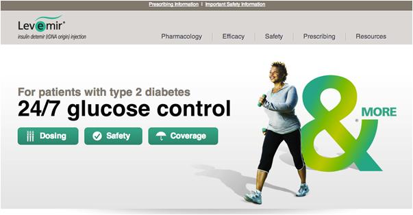
Enough bad news, how about some good news? Anyone in pharma dip their toes yet, and what were the results? Novo Nordisk, often ahead of the curve when it comes to emerging communication trends and applied digital technology within the pharmaceutical space, has already stepped up to the plate far as effective responsive design implementation goes. As Ross Fetterolf, SVP of Digital Strategy at Ignite Health has noted, two of their websites already embody optimal responsive play while meeting both regulatory expectation and the distinctive needs of their mobile users: LevemirPro.com…
Figure 1: Levemir®¹
 ,
and NovoLogPro.com…
Figure 2: NovoLog®²
Take a look from your desktop, then a smartphone or tablet, and watch what happens to the navigation, content, and key calls-to-action. Fundamental elements reconfigure in a focused, effective manner based on regulatory requirements and prioritization according to user needs. The simple, intuitive, and straightforward structure of the core site adapts well to mobile repurposing, so that the various iterations take advantage of the salient components while disregarding all extraneous features that would only interfere with an optimal mobile user experience. The multichannel expressions are all very different, yet flavored the same.
That brings up a critical point: for responsive design to work, the core website driving the various channels needs to be reverse engineered to accommodate mobile formats. What’s particularly fascinating is how mobile design has dovetailed back into standard Web design, leading to more compelling UX and content management standards throughout the Internet. Gone are the days when websites feature complex home pages and a dozen nav choices, as users now embrace one, two, maximum three active touch points that drive simple messaging and actions that are executable in seconds, not minutes.
 ,
"What’s particularly fascinating is how mobile design has dovetailed back into standard Web design..."
 ,
What this means for pharma
In terms of key takeaways, “responsive design” is a welcome third option for pharma digital communicators, but must be approached in a strategic manner with experienced help. The tactic, in and of itself, will neither reduce cost, timing, nor hassle for brand marketing teams, it will, however, empower them with the most sophisticated methodology, and train communications specialists to embrace simple, straightforward, and proven effective approaches to messaging, design, and digital implementation. The technique paves the way for the future, but requires as much — if not more — effort than conventional strategies.
Soon “mobile” will cease to have meaning as all media becomes personal and portable, customized to the individual and universally accessible. Until then, techniques such as responsive design will help all industries including pharma get the most out of mobile, but with caution, some hassle, and added cost. Much like social media, baby steps before triathlon lunges are especially appropriate for pharma, but it behooves the industry to experiment and routinely participate in emerging tech, especially with the precedent already being set by pioneers like Novo Nordisk and others who have already dived in swimming.
References
 ,
About the author:
Michael Spitz is SVP, Managing Director of the Healthcare and LifeSciences division of ZEMOGA. Spitz combines his passion for technology with more than 15 years of clinical content expertise to help engineer digital healthcare solutions. Follow @SpitzStrategy on Twitter for his daily – often hourly – updates on all things digital for the ultimate benefit of patients worldwide.
What are your recommendations for making mhealth more effective?


