New approaches to health data visualisation

Technology advances offer almost unlimited capabilities for processing and presenting health data in accessible and intuitive ways. Oleksandr Topachevskyi outlines the options available.
Over the past five years presentation of health data has undergone significant changes, influencing not only patients but also how decision makers and healthcare payers make their policy and purchasing decisions.
Previously health data visualisations were usually presented as simple, one-page dashboards with charts, interactive elements, and accompanying messages. Now, the rapid evolution of web and software technologies provides almost unlimited capabilities to process and visualise myriads of data points in milliseconds. The outlining of complex information or a story in a simple and intuitive visual way has become easier with the emergence of UI/UX engineering and a wide variety of open source tools and libraries to present data in an interactive way.
The environment has changed as well. Digital users are increasingly switching to mobile devices like smartphones and tablets, leaving the days of desktop domination behind. Major content providers have adapted to these changes. Social media services, like Facebook, LinkedIn and Twitter, have changed the way we consume content. Mobile platforms enable us to scroll through massive streams of content and quickly distinguish between something that is significant and something that is not. This, in turn, has led to completely new data visualisation approaches, such as Scrollytelling.
The following examples have been taken from the public health and wider data science arenas.
Scrollytelling
An impressive example of the scrollytelling approach to explain complex concepts is R2D3’s Introduction to Machine Learning.
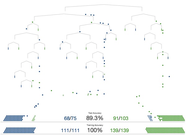
This approach is ideal to visualise a linear story without users needing to drill down and around the data. It usually incorporates just one interaction type, which is the scroll, and rarely has other types, like clicks or hovers. The scroll enables easy movement back and forth in the story, as well as smooth graphic transitions. This approach emphasises the story flow linearity, helping users to quickly grasp how data and text are connected in the overall story.
Linear story with user exploration
The next example – Urbanization in Eastern Asia – combines linear story narration with users’ ability to explore the data presented and drill down into additional ‘class’ details, such as region or age. It consists of two modes: story flow and user exploration. The first one summarises key arguments, figures and data patterns. In the second mode, the user automatically enters the data exploration phase which, with the help of user interactions like clicks and hovers, allows investigation of specific data points and the relationships between them.
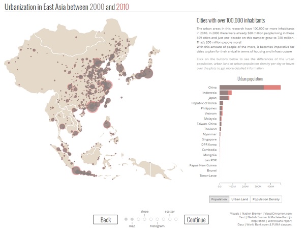
This approach is ideal for delivering both generic and tailored model results to users. Usually people appreciate the ability to customise the data to suit their own situation, location or role. It is fine to present a data story in a linear fashion, but it gains value when users can interact with it and explore the aspects they choose. Thus, a linear story with user exploration integrates both elements into a single application. This approach is also the best choice where a story consists of several interconnected concepts, each with its own visual representation.
Linear story with adjustable input parameters
The eModel example delivers the tailored results of a health economics budget impact model, based on parameters entered by the end user. It guides payers and healthcare providers though a number of clinical, and related, economic differentiators. Decision makers can modify key input data, reflecting their own setting, to produce personalised results.
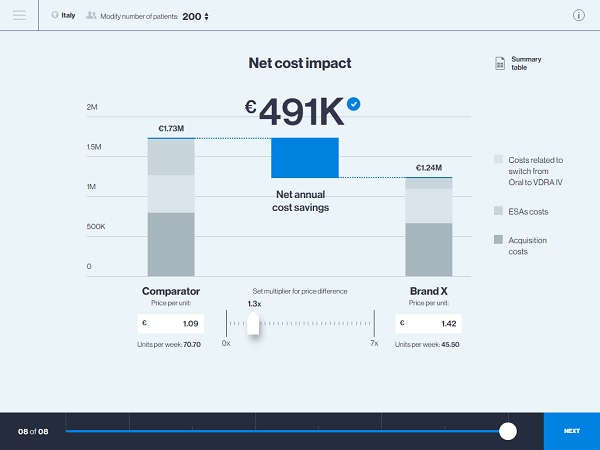
This approach is a clear and straightforward tool for sales representatives and medical science liaisons to use when engaging payers and providers, as it provides maximum flexibility and data manipulation capabilities in order to make results as precise and tailored as possible.
Interactive infographics
Back in the late 2000s the internet was crowded with quirky experimental infographics. Recently these have become more mature, corporate and goal driven. These ‘new infographics’, or ‘web graphics’, have a number of distinctive features, such as clear presentation of information, intuitive interactivity and subtle animations. These features improve user experience and impart information in a structured fashion.
The Vitamin Atlas by Hyperakt Studio is a good example of interactive infographics. It’s a fun and informative tool designed to help people understand the correlations between common foods and vitamins. The tool explains quite complex concepts in an easy-to-understand way, while helping users to discover what keeps people healthy.
Another example delivering classic editorial empowered with interactive visualisations is the Internet of Things interactive dataviz tour. This incorporates a few popular D3.js widgets (like Zoomable Circle Packing) to fluently convey the basics of the technology.
The infographics approach is suitable for presenting large arrays of data, particularly in cases when the story is not linear. It is great to use when the content is separated into independent sections and it is not necessary for the user to explore all sections.
Recommendations
All of the approaches mentioned include some or all of the following principles, which should be included whenever possible:
- Bring data to the user as an engaging story
- Allow the user to control story flow and explore data with web interactions
- Include user interface elements which enable easy data filters and highlights, as opposed to static visualisations with a single dimension and viewpoint
- Allow users to change input parameters on the go and easily follow the results
- Customise different scenarios for user presets: regions, countries, products, indexes – thereby providing only the information which is important to them
- Enable a user-friendly web experience across all devices with HTML5/JS/CSS.
- Focus on modern visual language guidelines (Material Design, IBM Design Language, etc.) to make stories accessible to the majority of users.
Together these simple tips can greatly improve users’ data exploration experiences and the relevance of the information delivered. Migration of data visualisations to the web/mobile environment provides much wider capabilities for sharing, updating, analytics and customisations tailoring information to the user’s own perspective. Now, data can always be live and up to date. Wide adoption of cloud and database capabilities enable automated data collection from a variety of sources, as well as fast data processing and effective data visualisations with frameworks like D3.js.
About the author:
Oleksandr Topachevskyi works at the intersection of health economics, modelling, statistics, data visualisations, software development, Design, UI/UX and develops apps/tools that communicate health data and economic models digitally. He is a founder of Digital Health Outcomes, a consulting agency, producing interactive economic models and data visualisations for the life sciences and healthcare sectors. He has over 10 years of experience in economic evaluation of health interventions and company/asset valuation.
He has published 20+ health economics manuscripts and abstracts.
Read more on digital: