Welcome to the new pharmaphorum
Our website has served us well over the years, but after five years since the last re-design – during which aesthetic standards have changed and website technology has improved – we decided it was time for a refresh.
Your navigation experience on the new pharmaphorum shouldn’t be too different from what you’re used to – and hopefully you’ll find it offers faster load times, easier navigation, and better suggestions for other articles to check out.
Miles of tiles
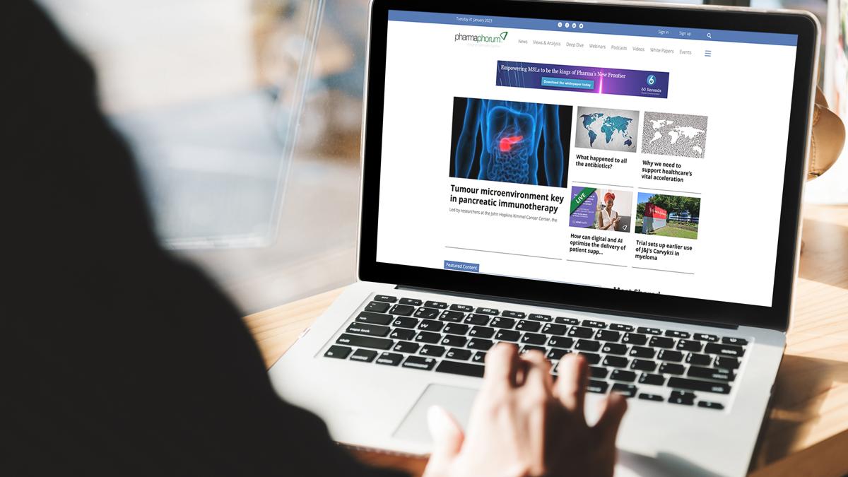
Throughout the new site, we use modular tiles. These will allow us to more easily highlight timely features like live event coverage or breaking news, while automatically placing new stories on the top of the site the rest of the time. The front page is organised into sections, with featured news at the top, followed by the newest Views and Analysis features, Deep Dive stories, Whitepapers and Webinars, and Podcasts and Videos. Under that you can find our partner content.
You’ll find the same tiles as you drill down into the pages for News, Views and Analysis, Whitepapers, Webinars, Podcasts, and Videos. Our Deep Dive page is organised into issues as it always has been, and navigation within the magazine hasn’t changed at all.
We’ve removed automated sliders, which can hide important stories and create a user experience that some find frustrating, as well as using up your computer’s resources and potentially slowing site performance.
Channels & Categories: Organisation two ways
Stories on our site are organised by content type (the Categories listed above) but we also organise them into our familiar topic-driven Channels: Sales & Marketing, R&D, Digital, Market Access, Oncology, and Patients. In the new site, you can navigate by Category via navigation bars at the top of the site and Channel via the bar at the bottom of the site. If you click on the triple line icon at the far right of the top navigation bar, you can also access Channel pages there. And if you mouse over the Channels on the bottom of the page (or tap them once on the mobile page) you can further subdivide by Category. So you can find just Deep Dive stories about Patients, for instance.
But there’s more. Our new modular tiles also contain Channel information. If you mouse over them on the desktop site or tap them on the mobile site, they’ll light up in that Channel’s corresponding colour with a Channel label. And, in order to be crystal clear with our readers about where they’re content is coming from, all Sponsored Content and Partner Content will light up with a special white label when you mouse over or tap its tile.
Interested in pharma events? Our event calendar hasn’t gone away, and its accessible by clicking Events in the top navigation bar. Or you can see our live blogs by clicking on Live Coverage in the triple-line pop-out menu.
Wherever our Channels are displayed you’ll also find a navigation option that says “Spotlight”: As we always have, we’ll use this space to highlight special projects and article collections.
Looking Ahead
In addition to better performance and organisation, we’ve designed this website with an eye toward future improvements. So stay tuned for a more comprehensive events experience, user customisation options, and more. We’ll be launching a reader survey soon to collect your input about the new website and your pharmaphorum experience more broadly, but in the meantime feel free to reach out directly at Jonah.comstock@pharmaphorum.com.